
A PhotoPedagogy Facelift
Updating the design of our website.

PhotoPedagogy was 10 years old in 2025. The design of the website has stayed pretty much the same for that period of time. Chris is a very skilled illustrator and was responsible for all the graphic elements of the site but neither of us is a web designer. We opted for a simple web based WYSIWYG platform and did our best.
The site has had a couple of tweaks over the years but nothing significant. We established a colour scheme and preferred fonts early on and have stuck with them.
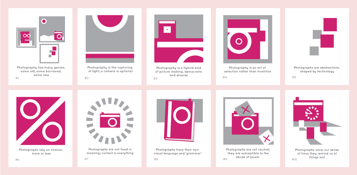
However, two things have bugged me for some time:
The design has looked a bit stale and uninviting.
The practitioner examples are predominantly American and European and don’t reflect the diversity of the subject.
For a resource that aspires to support all photography educators, both of these issues have become increasingly troubling. This year I have a bit more time on my hands. I’ve been trying to write a book about teaching photography. I’ve also committed to doing something about the website, updating the design and the various resources to make them more diverse and inclusive. Here are a few screenshots of the newly designed site. I’m still working on developing various bits of code to adapt the look and feel. As a non-specialist this takes me a while and makes my head hurt. I hope it’s worth it.
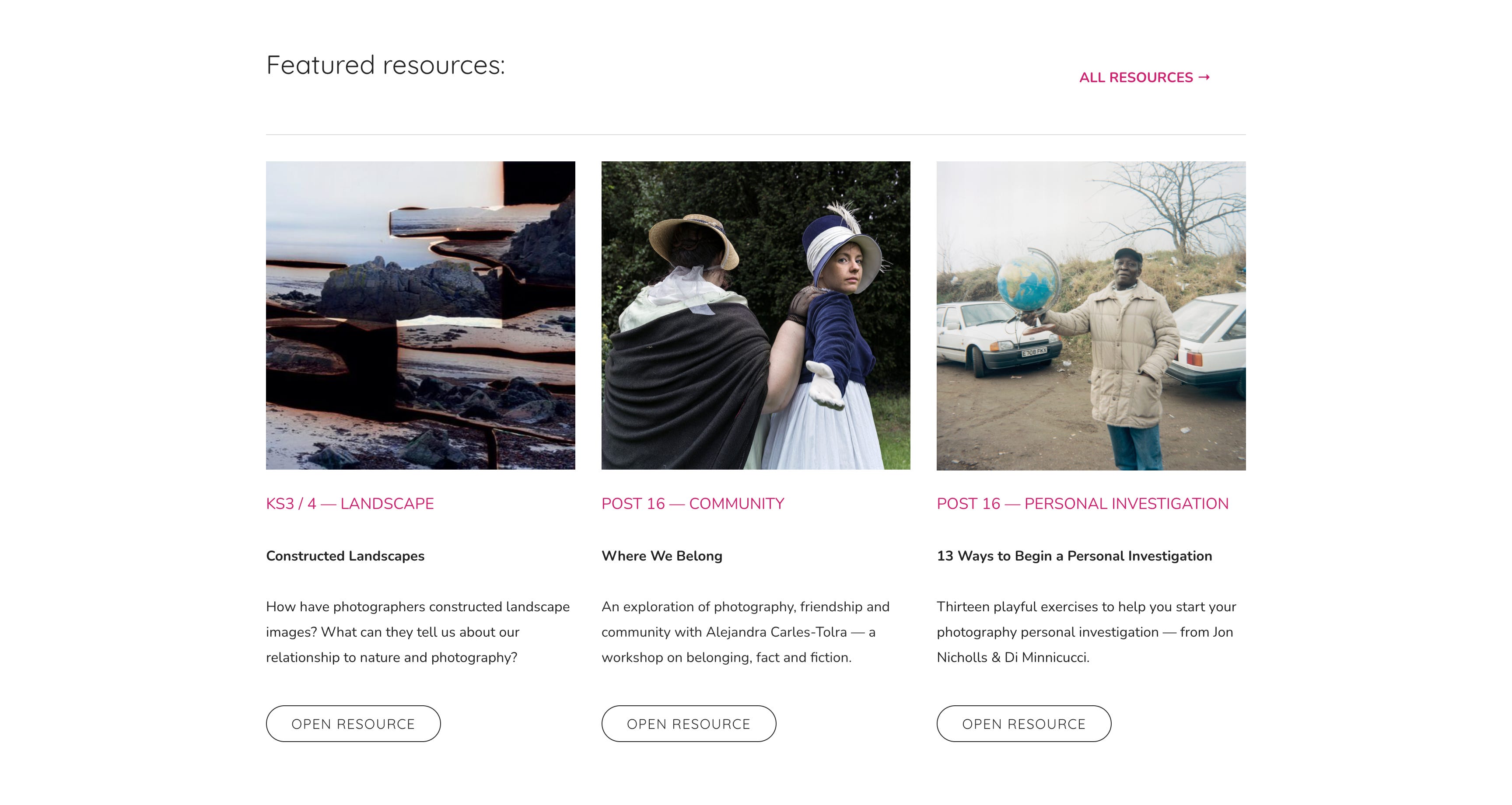
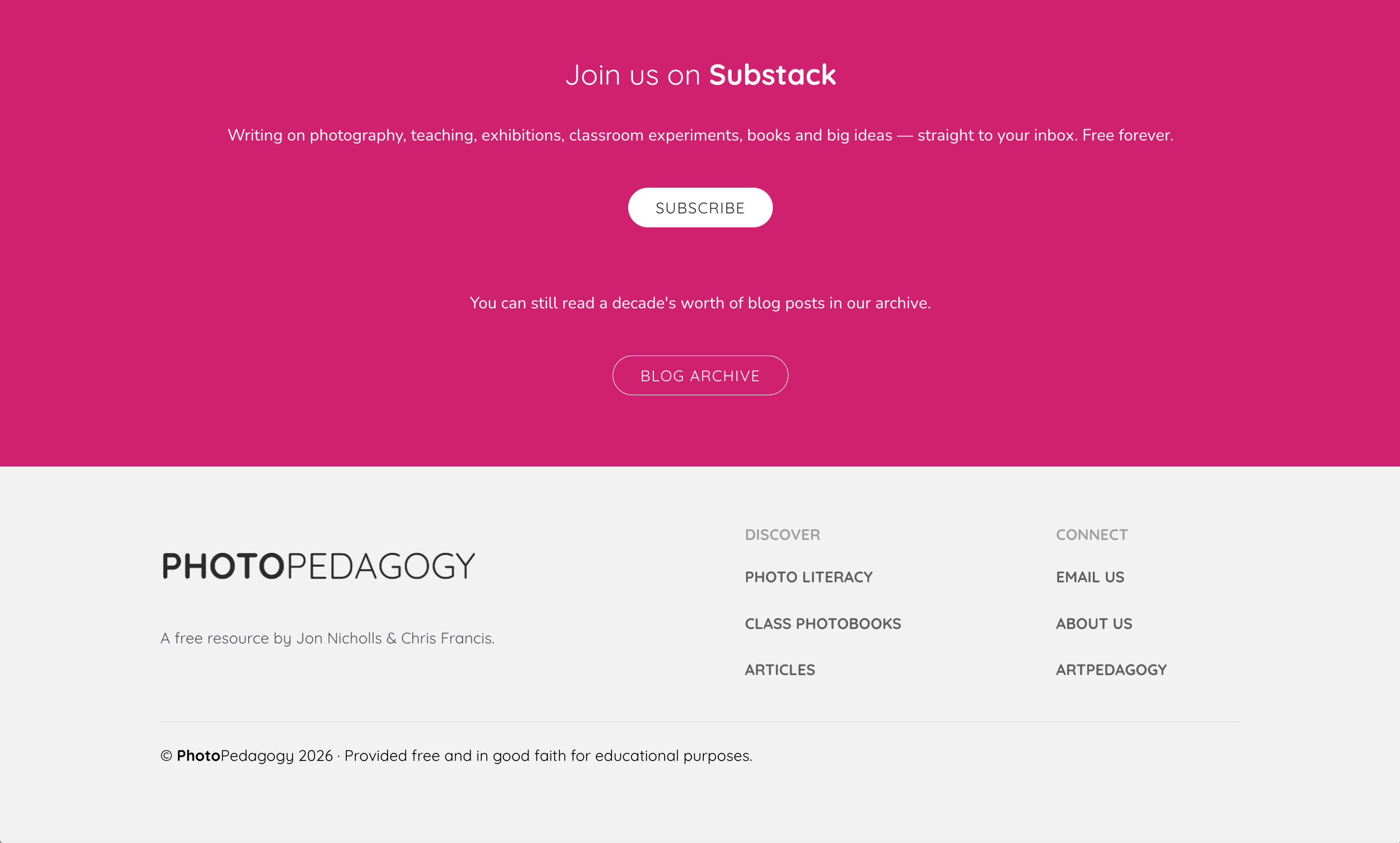
The homepage
It might seem odd to use screenshots. After all, you could just visit the site and do your own scrolling). But, as a photography teacher, I like to think about what’s on screen as an image. Chris has also created a brilliant resource for KS3/4 all about the screenshot as photograph.
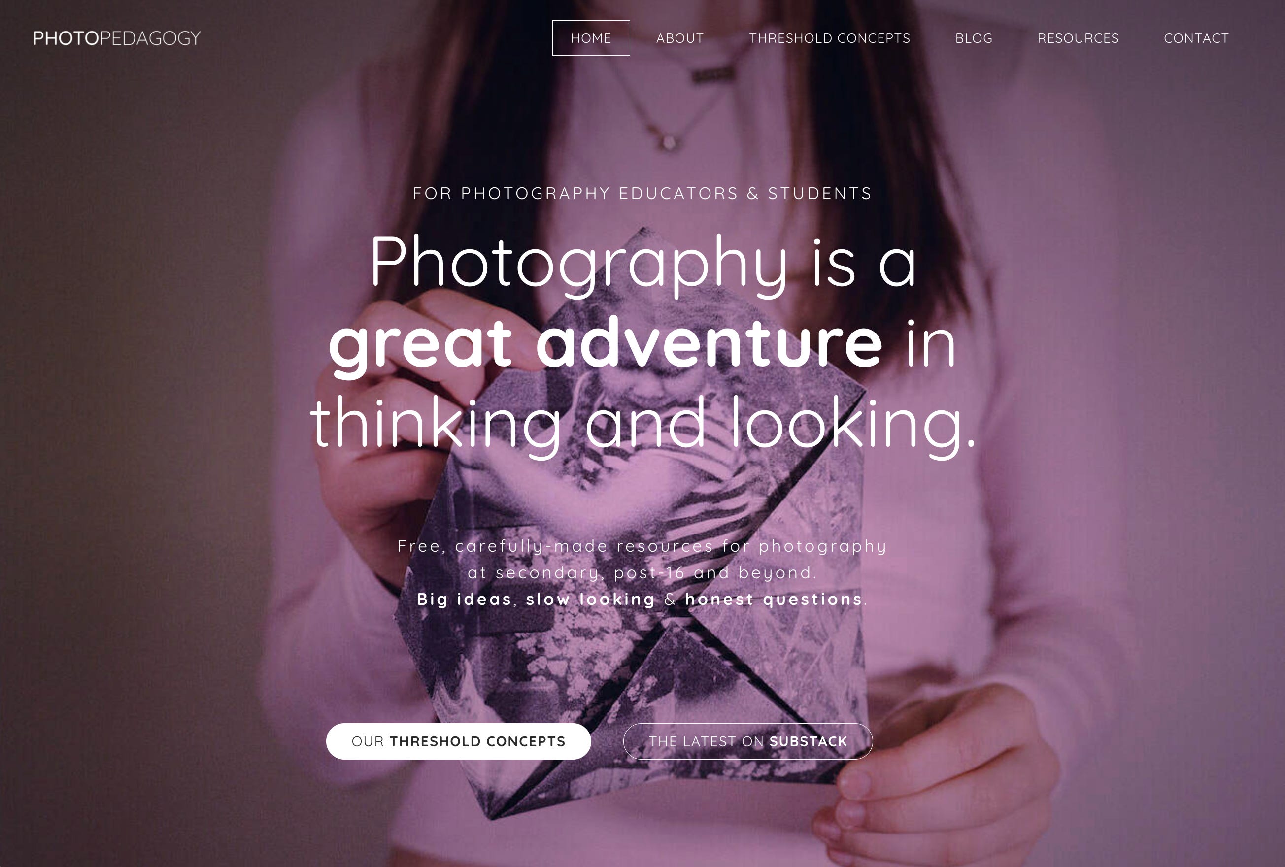
The quote about photography being a “great adventure” is borrowed from Luigi Ghirri:
Photography is a great adventure in thinking and looking, a wonderful magic toy that miraculously manages to combine our adult awareness with the fairy-tale world of childhood, a never-ending journey through great and small, through variations and the realm of illusions and appearances, a labyrinthine and specular place of multitudes and simulation.
The header image is by Scarlett, an A-level photographer from Thomas Tallis School who graduated last year. The image was shot on medium format colour film and is a self-portrait featuring images of her younger self on fortune tellers. It spoke to me about chance, identity, change, memory and the magical transformation that many students experience after engaging deeply with photographs. I’ve tried to make the homepage inviting in several ways, with links to the Threshold Concepts, the blog (this one and the archive) and other resources. I hope the tone is straightforward, practical and, above all, welcoming.
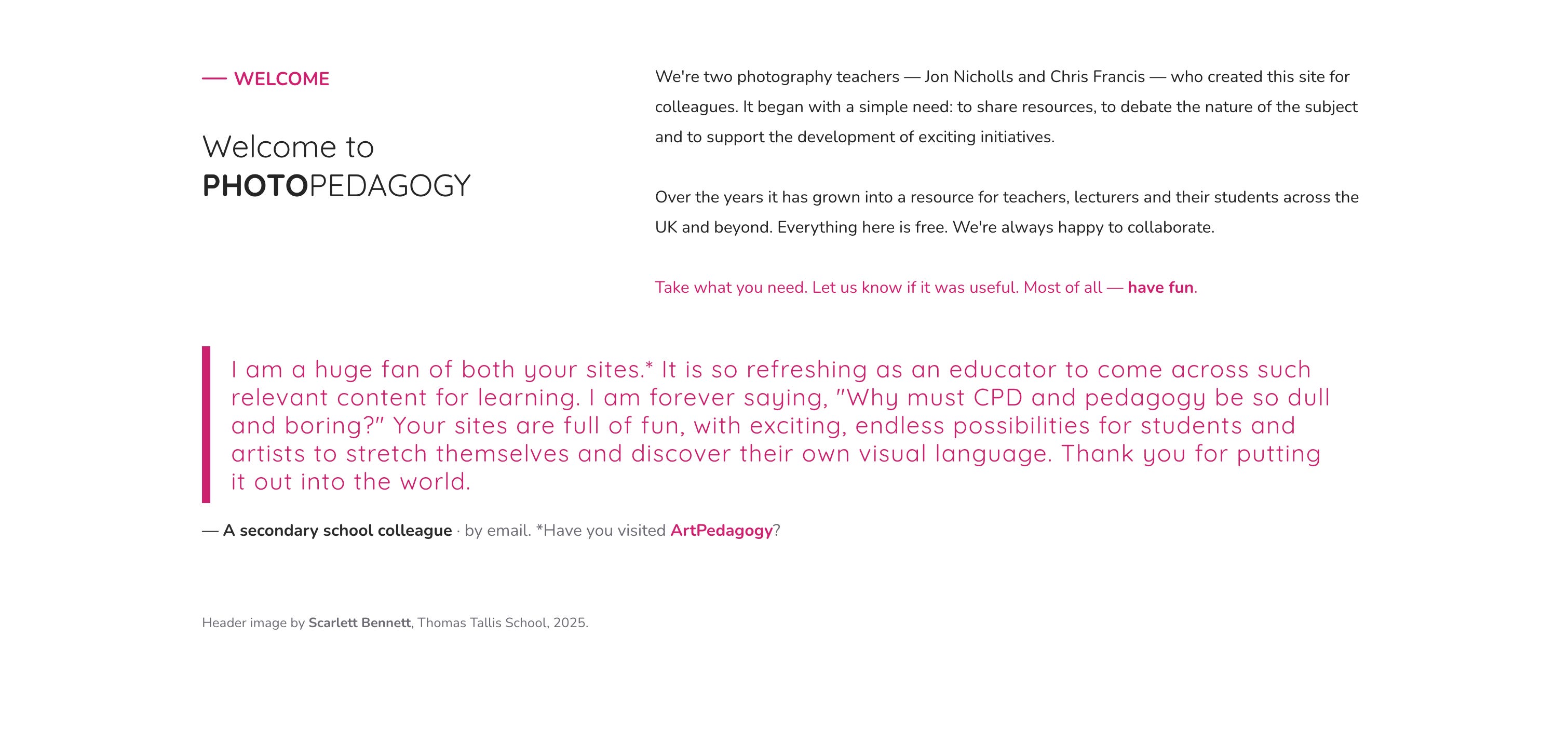
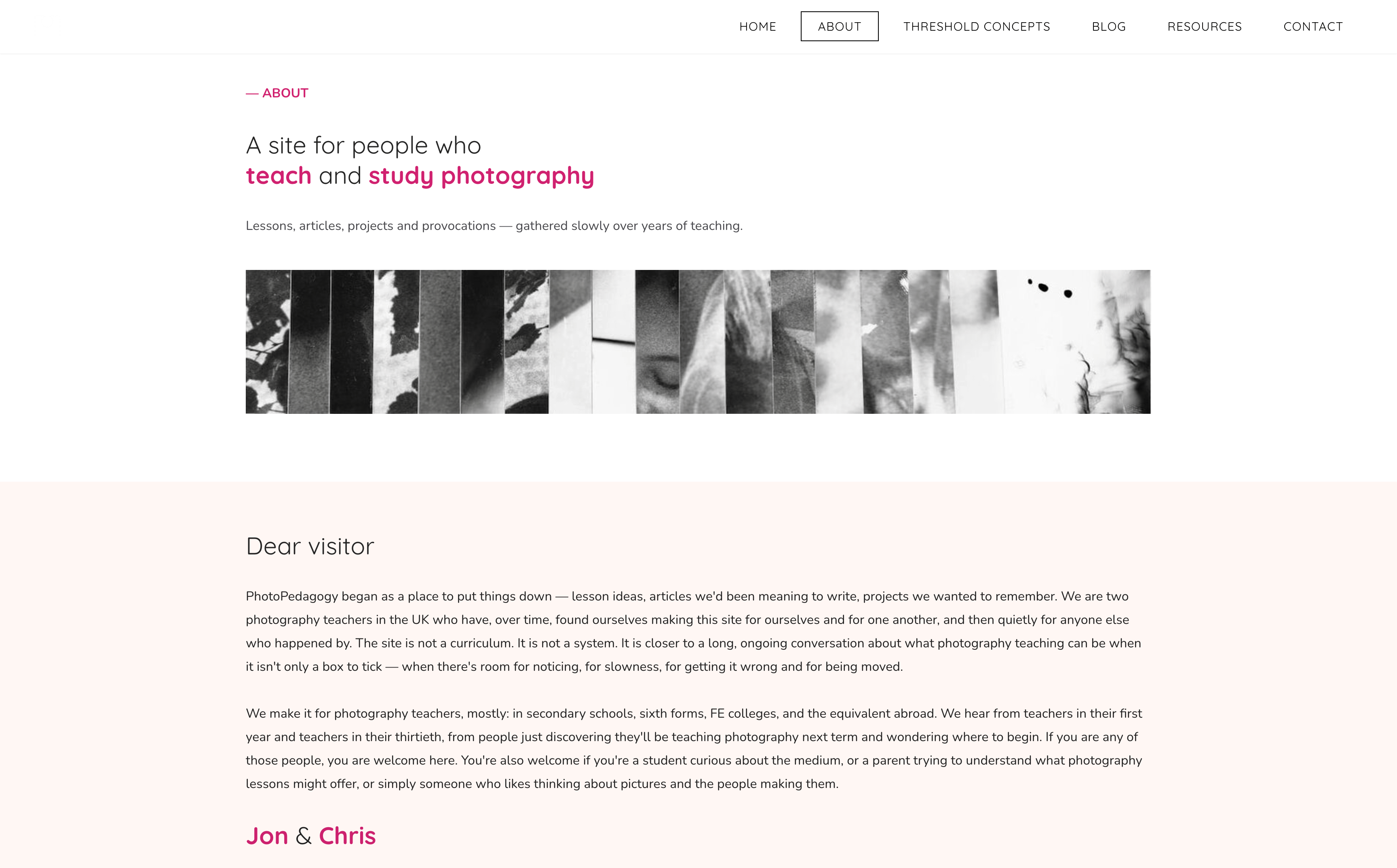
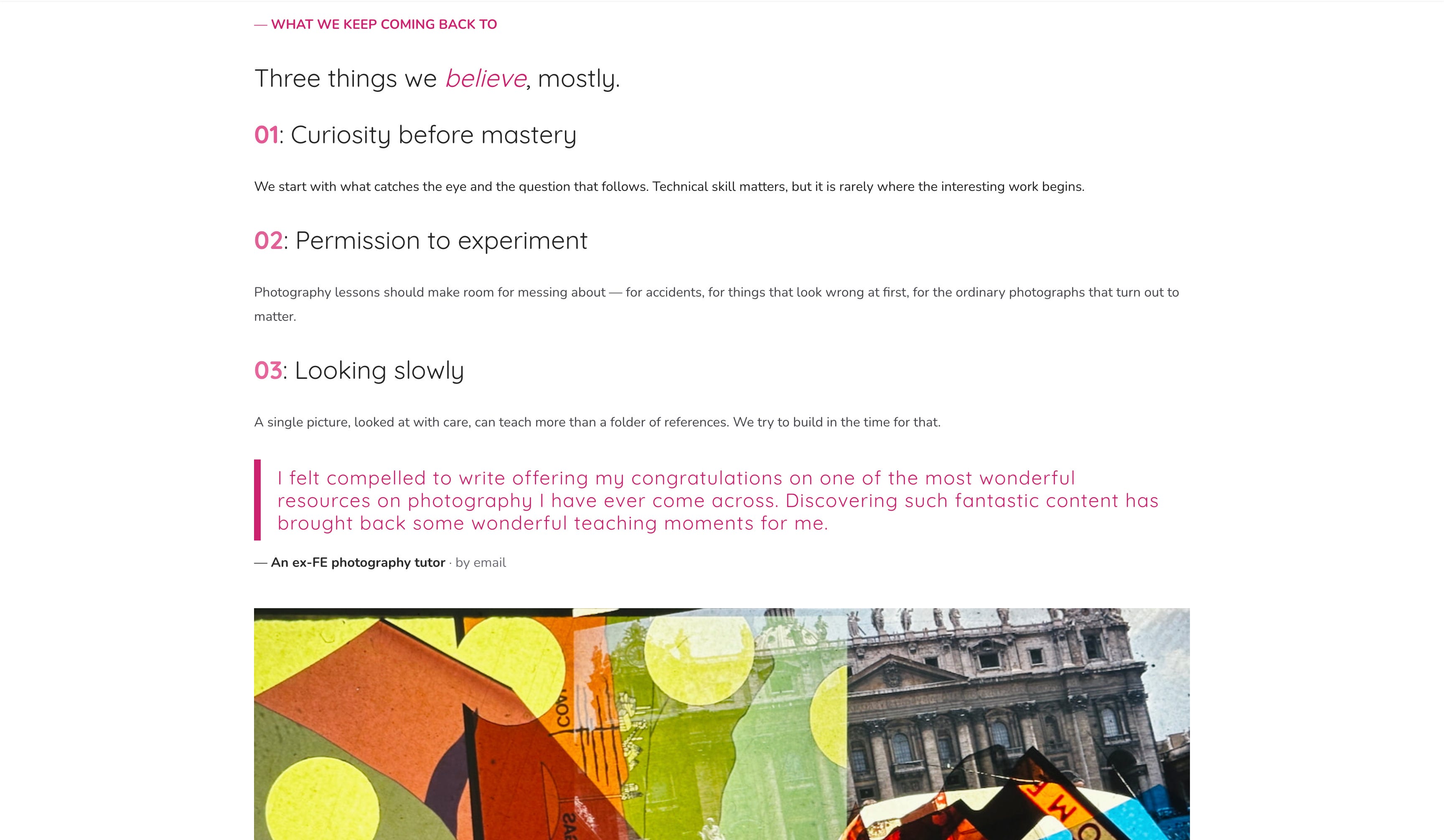
The new design attempts to be less cluttered. Each page element is given a bit more breathing room. Pages now have sections and background colours can be altered. Quotations are a bit more prominent. There’s a better balance between text and images. I’m still working on improvements. There are a lot of pages to attend to. The About page, slightly buried in the previous design, now has a proper welcome, a brief statement about our shared pedagogical attitude and a couple of testimonials. Lots of very kind people have contacted us over the years to share their thoughts.
About
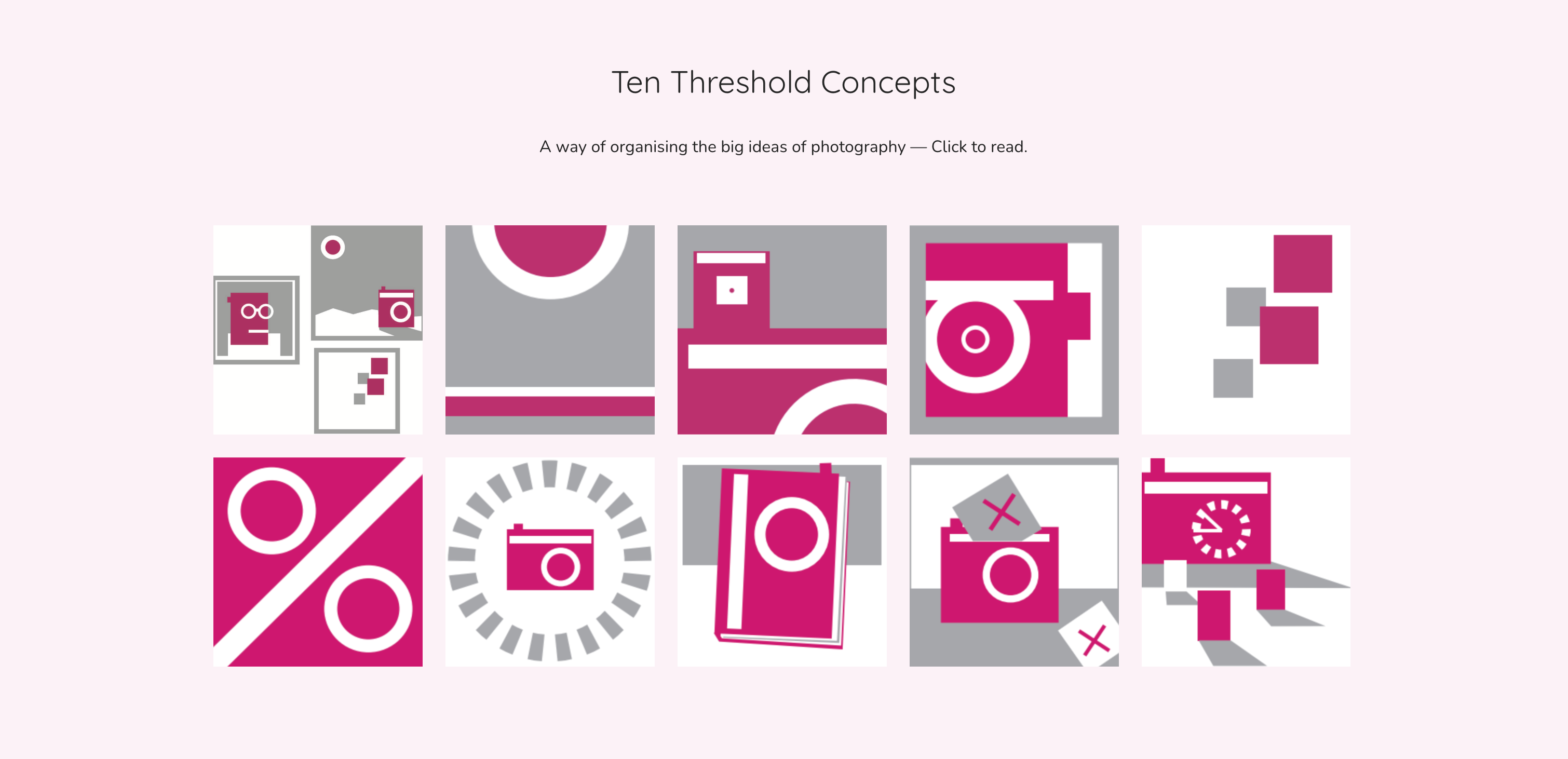
The resource pages (including our Threshold Concepts and collaborations with the RPS and Anthony Luvera) are more direct and focused, but still contain (we hope) some interesting digressions and troublesome knowledge.
Resources
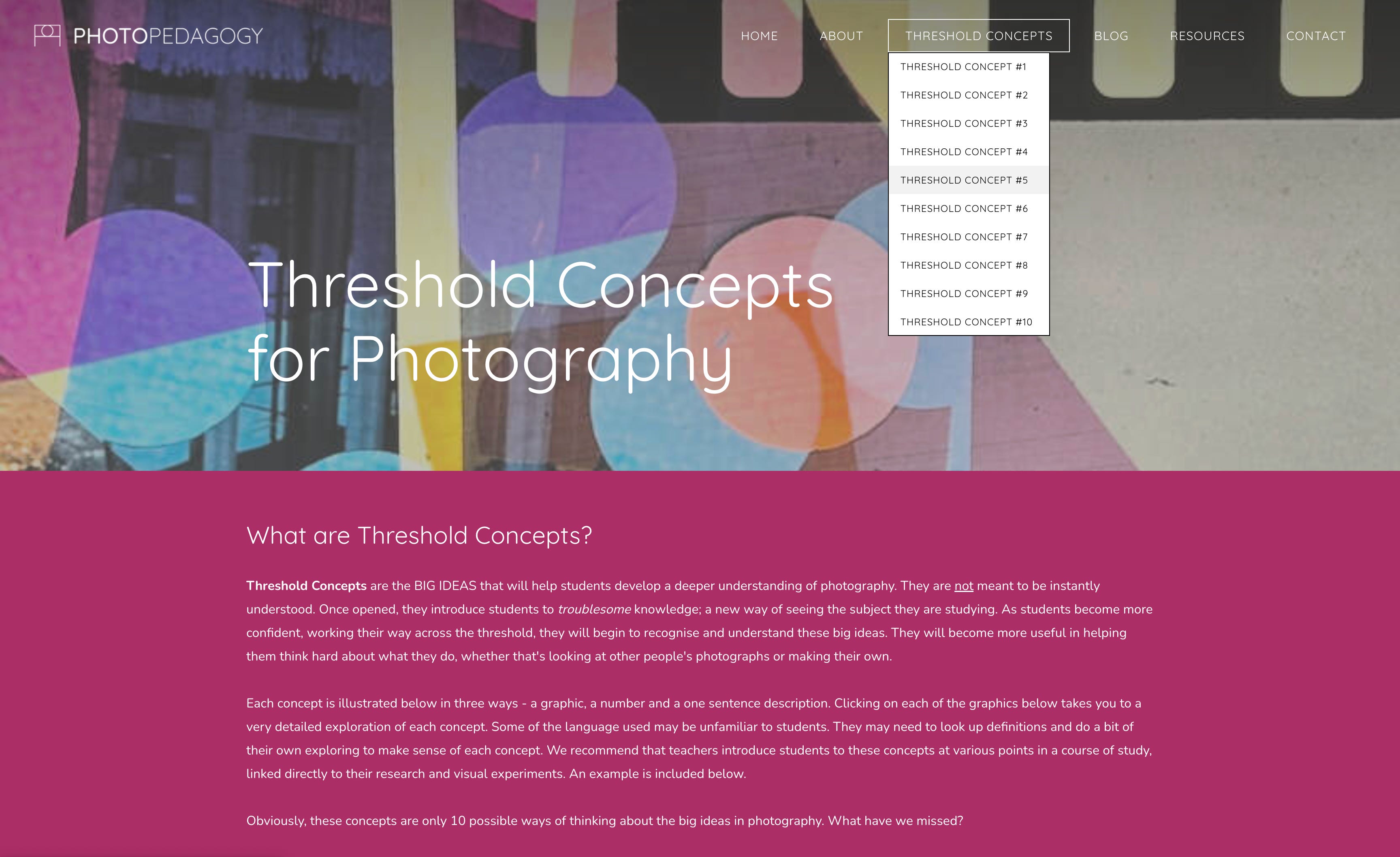
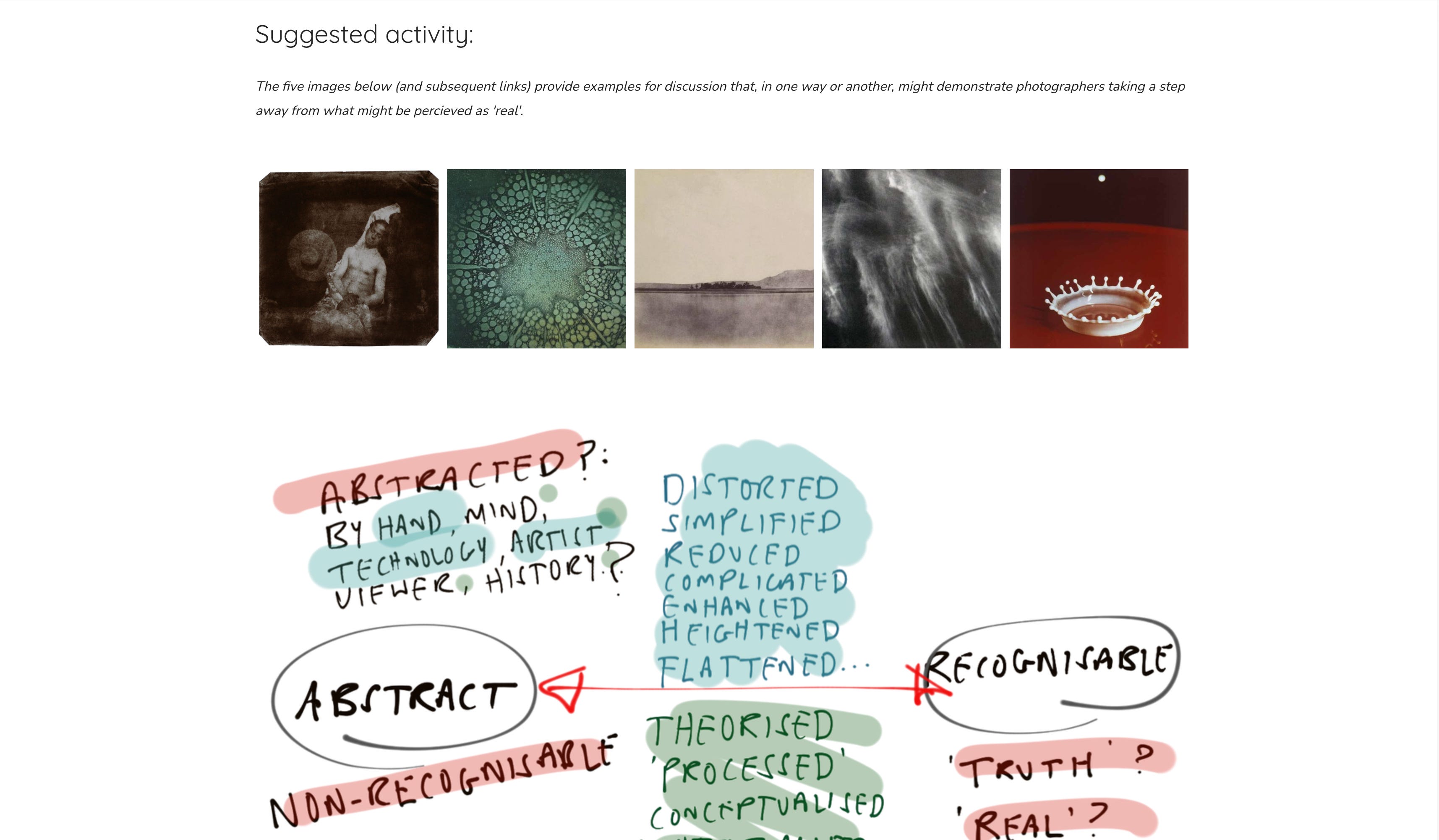
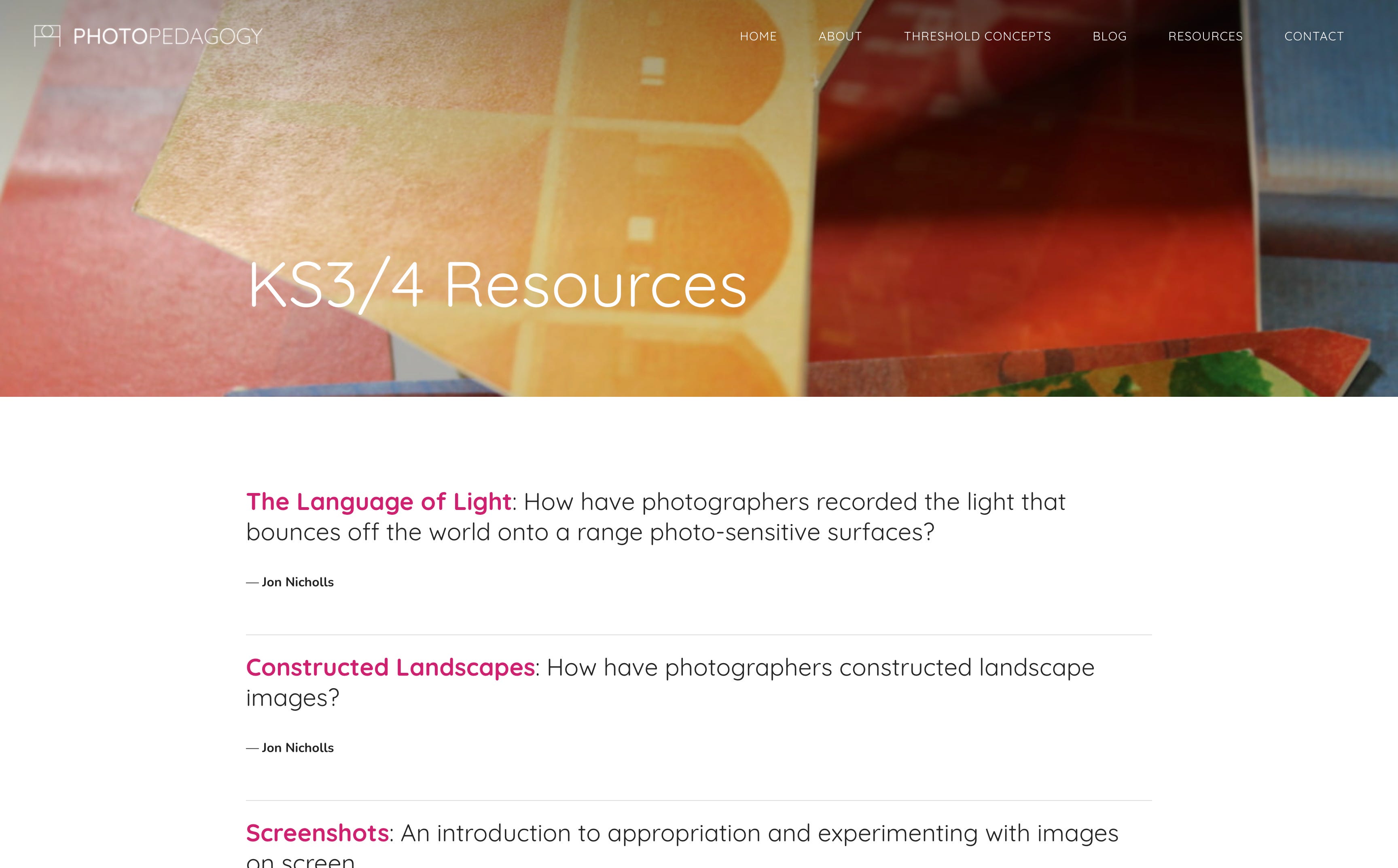
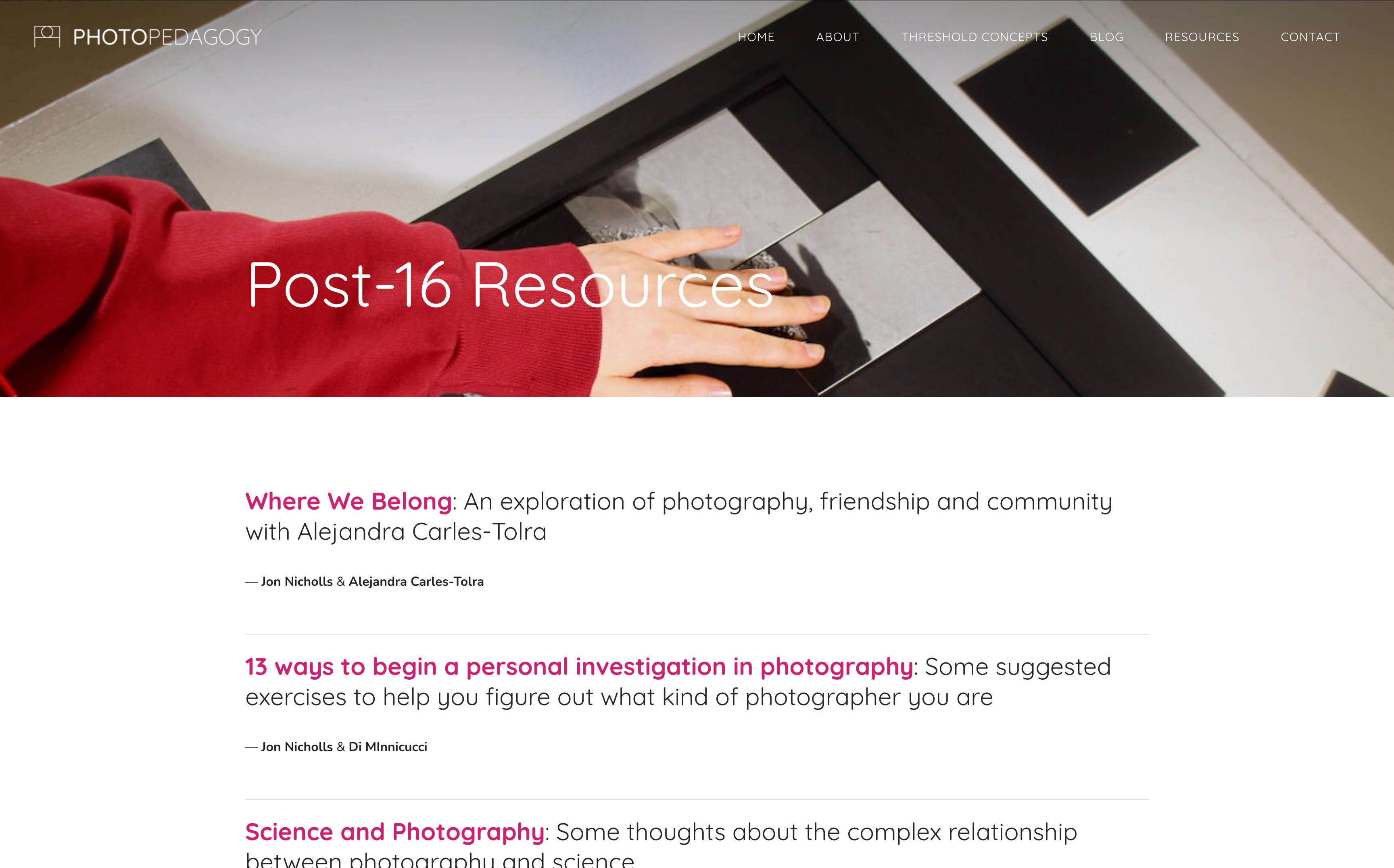
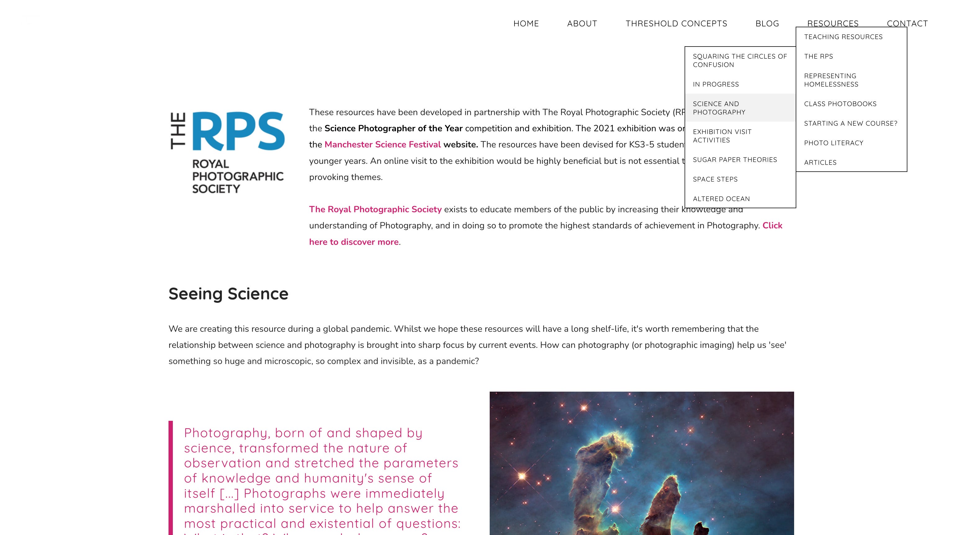
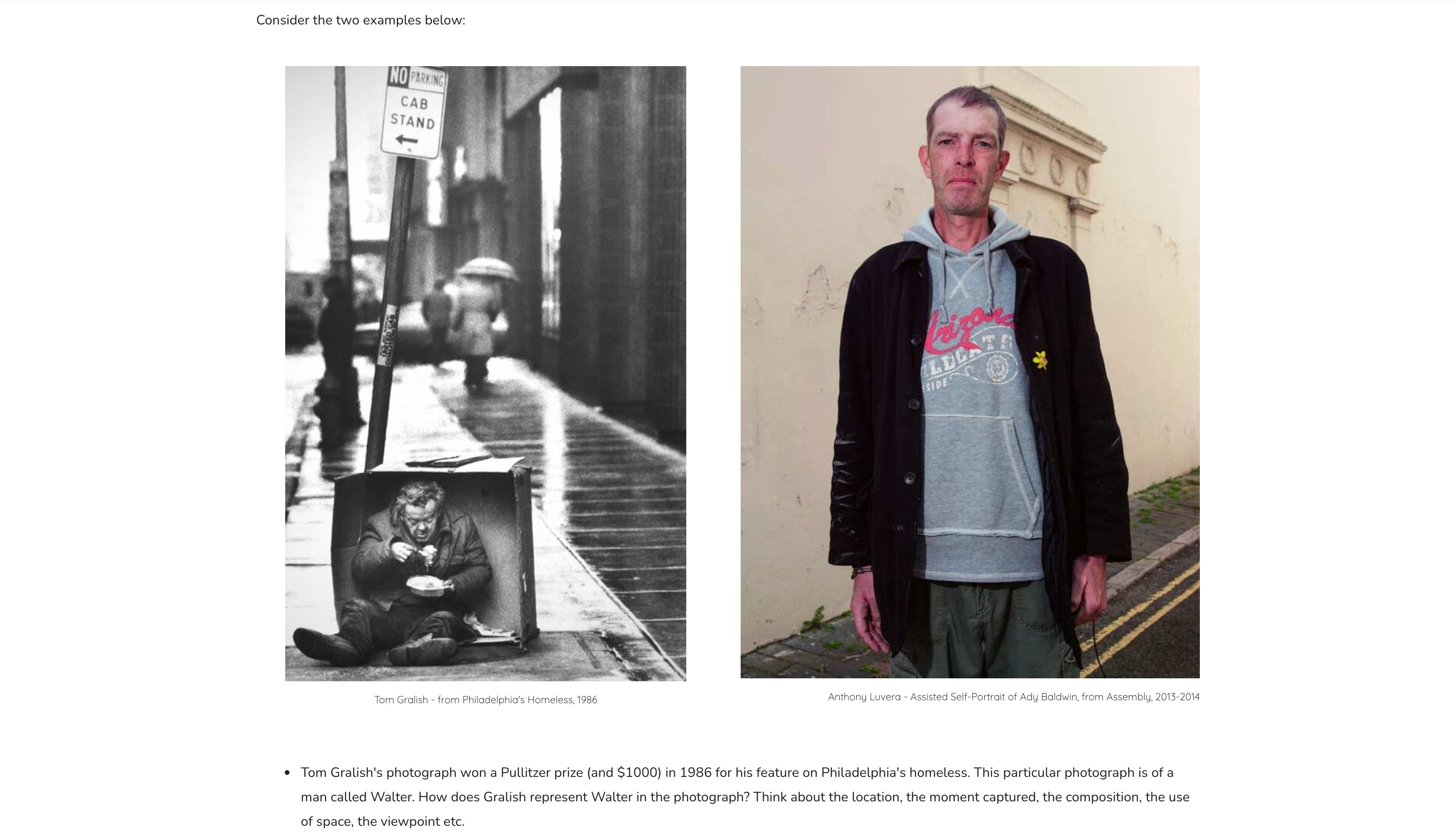
There is guidance about establishing a new course, thinking about Photo Literacy, about representing homelessness and making the best use of photobooks in the classroom.
Guidance
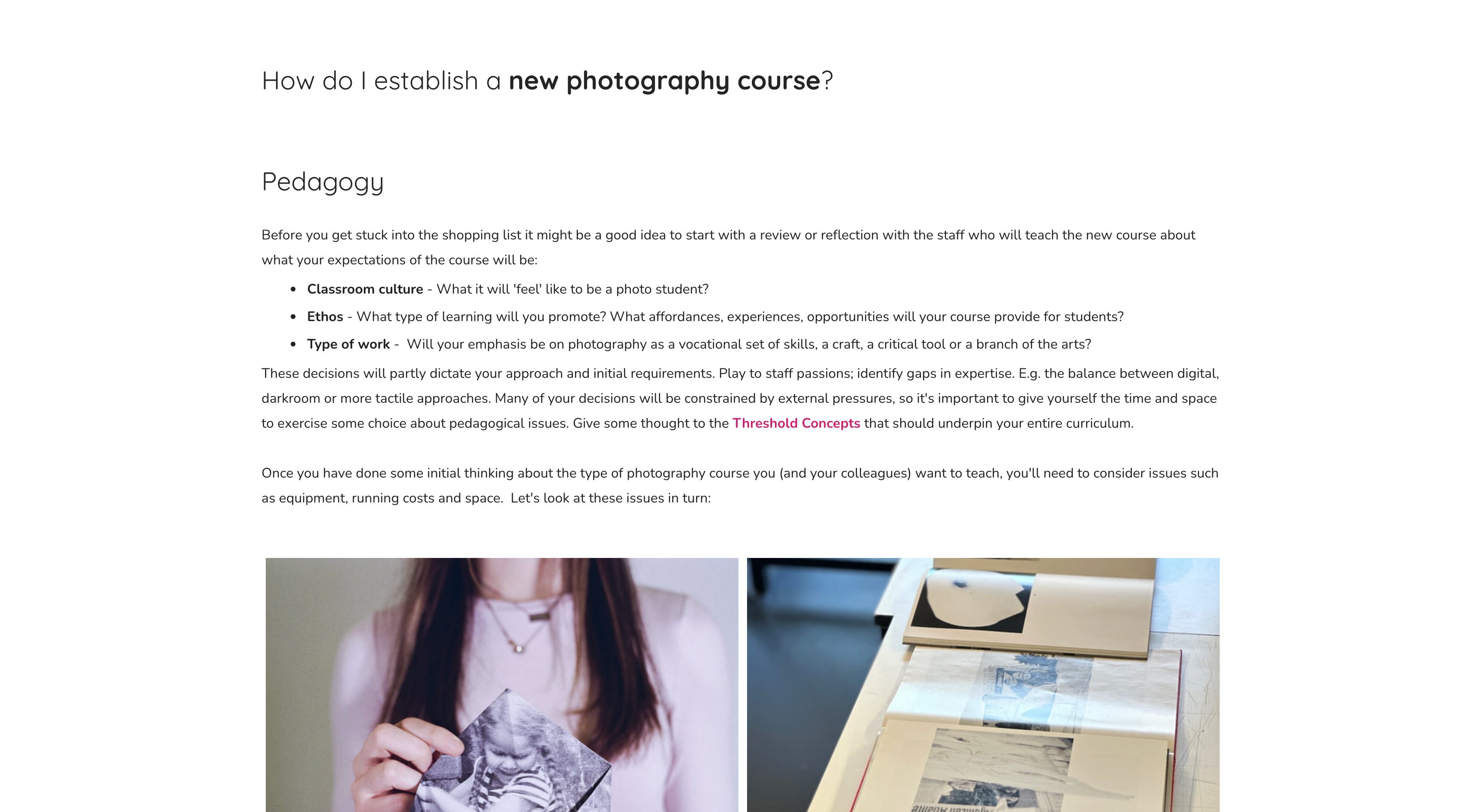
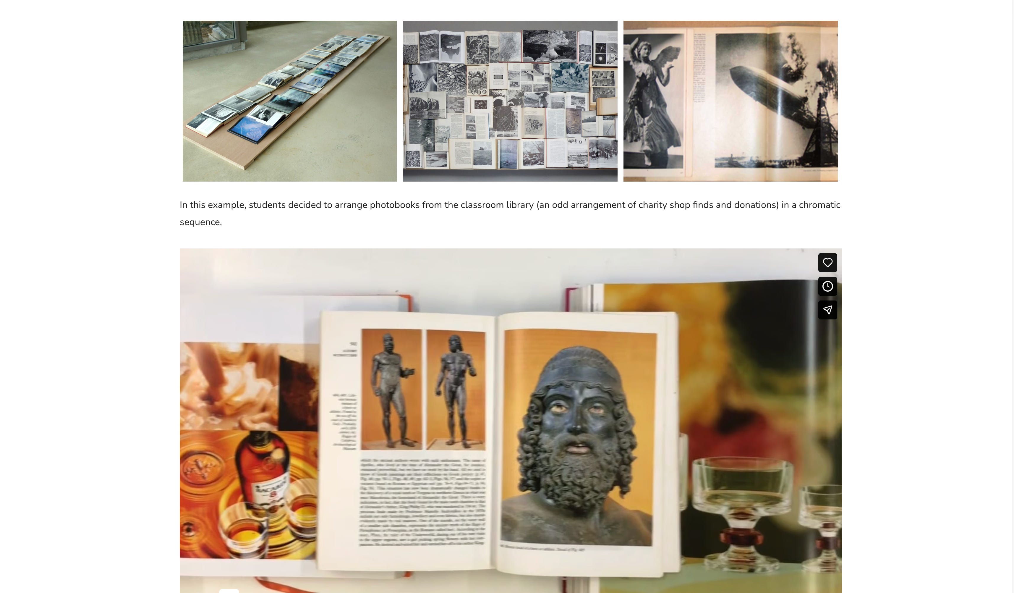
Broken links have been (mostly) mended. The menu structure has been simplified. Pictures lead the way. Subscribing to this blog is easy.
Inevitably, some things have been relegated to the waiting room. Older resources that weren’t getting much love. Bits of writing that don’t really belong any more. They may resurface in another form at some point. Apologies if something you have made or used is missing. I’ll get to it I promise.
The next big job is to ensure that the site is more representative of the diversity of photographic practices and histories. This is an exciting project that will involve lots of research, re-writing and image-sharing. Teaching photography is a great, ongoing adventure in thinking and looking.
Lastly, I’d really appreciate your feedback about the new site design. We have a few ideas for new resources but we’re always interested in collaborations, so if you have any ideas for things you’d like to see on the site or want to discuss partnering with us, don’t hesitate to get in touch, either via Substack or email.
Also, if you spot anything that looks a bit odd, do let us know.
See it. Say it. Sorted.
Until next time.
These posts will always be free but, if you enjoy reading them, you can support my analogue photography habit, and that of my students, by contributing to the film fund. Thanks to those of you who have already done so. All donations of whatever size are very gratefully received.
First visit today. It looks excellent and it's been added to my favourites. A resource I'll be dipping into on a regular basis, for sure. Well done to all involved...!
I love it. I loved it before. You remain my favorite Substacker for many reasons, Jon. And the site is what brought me to this already long and solid (I hope) friendship.